
Power BI is a powerful visualization application. In this blog, we will see how to create a bar chart in Power BI.
When to use a Bar chart in Power BI
Bar charts are used to compare values of unique data elements. Bars can be displayed vertically or horizontally. Bars can be stacked too. The size of the bar represents the value of the data element.
Download:
To recreate this example or to practice Power BI, download Power BI desktop.
New to Power BI? Get hands-on, step-by-step guidance in our Power BI for Beginners course. Start learning now.
Steps to create a bar chart in Power BI:
1. In this example, we will connect to Orders.xls table. If you are not familiar with connecting and loading XLS files in Power BI, visit connect to excel data source in Power BI.
2. On Power BI desktop, navigate to Report view, from Visualizations select the first chart i.e. Stacked bar chart. This will create a placeholder for the chart on the canvas.
3. Select the placeholder of the chart on the canvas, select the fields from the Data pane on the right that needs to be displayed on the chart.
For this example, I will use the following: Year and Sales.
Note: Year will be displayed under OrderDate -> Date Hierarchy. Power BI has automatically created a date hierarchy when the table was loaded.
This will create a Bar chart.
4. Under Visualization, you can see the placement of the fields in the following sections:
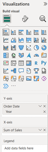
– To provide different colors to the bars for each of the year, place Year on Legend too.
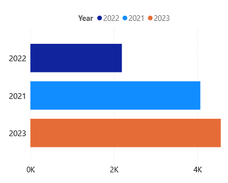
This will create a bar chart with different colors of the Year.
Under Visualization pane, click on the Format your visual icon to see different formatting options.
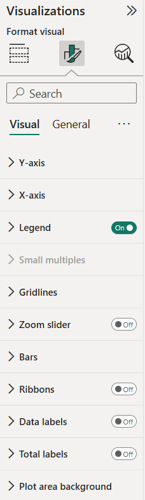
I will use the formatting options, to change the fonts of Y-Axis and X-Axis using Values option.
I will also make the Legend and title to appear in the Top center.

Chandraish Sinha is the Founder and President of Ohio Computer Academy, a leading institution committed to delivering high-quality IT education. With a passion for teaching and a belief in his company’s mission—Inspire, Educate & Evolve—Chandraish brings over 25 years of experience in the Information Technology industry.
Explore more of his work on his Amazon Author Profile.
0 Comments
0 Comments



Post a Comment